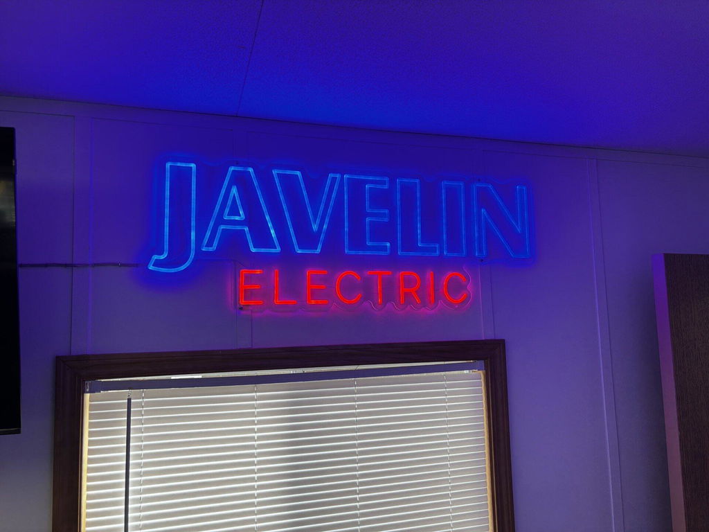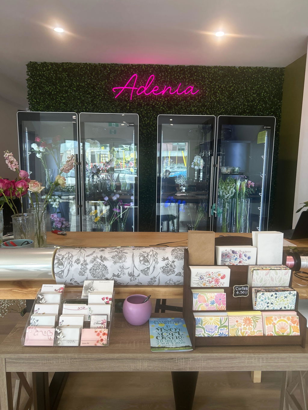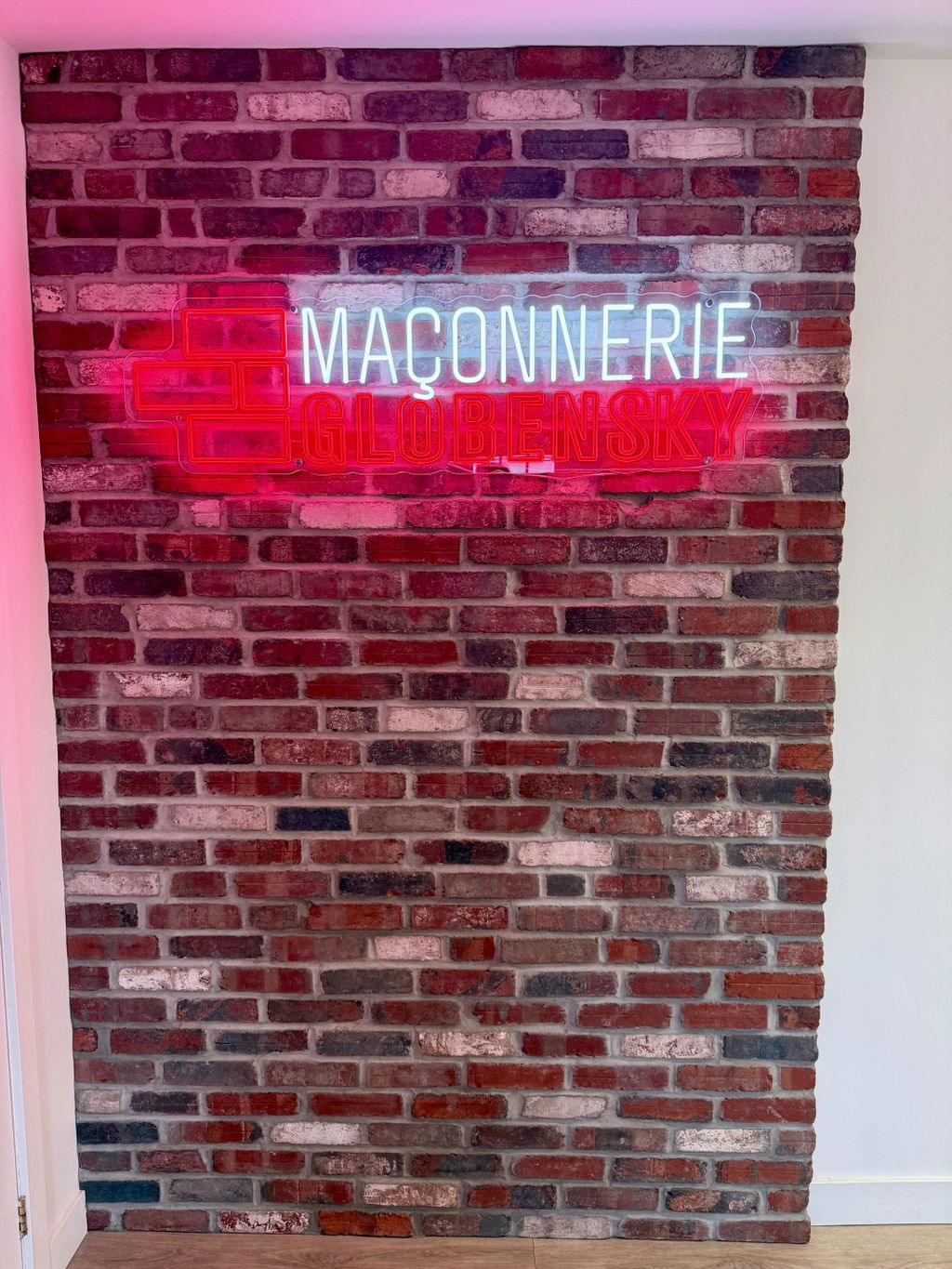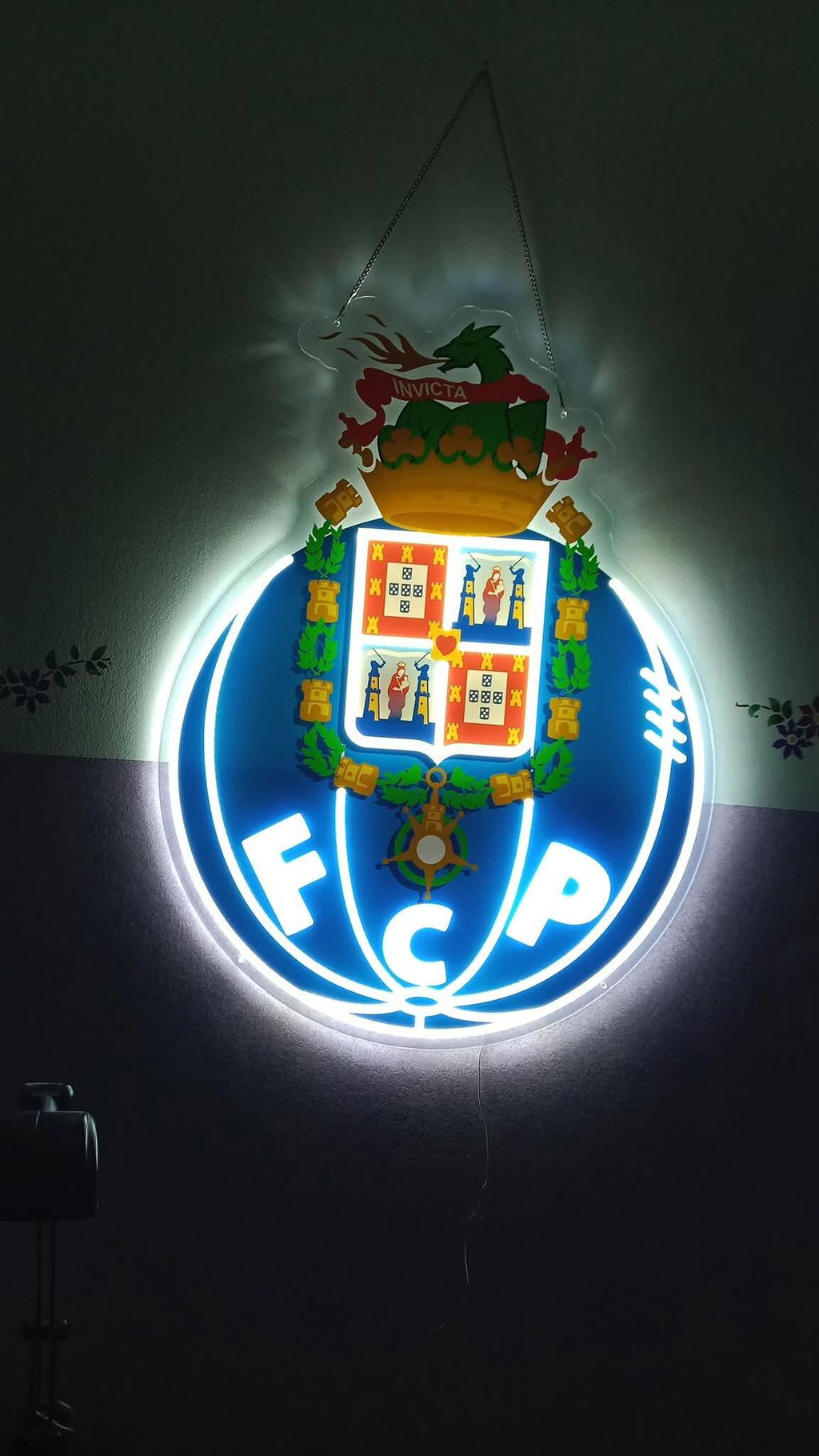

You spent time getting your logo colours right. Your navy is your navy, your gold is your gold. Then the light box goes up, the lights come on, and suddenly the navy looks like a bright royal blue and the gold looks closer to lemon yellow.
It's one of the most common surprises with backlit signs, and it's almost always down to how the face was printed. Here's why it happens, and what we do about it.
Why Does Backlighting Wash Out Colour?
A light box works by shining LEDs through a translucent face, usually acrylic or a translucent film. That's what makes it glow evenly, and it's also what makes colour tricky.
- Light passes through the ink, not off it. In daylight you see the colour by reflected light, the way you'd see any printed surface. Once the sign is lit, most of what you see is light coming through the ink from behind. A thin ink layer doesn't hold back enough of that light, so the colour looks paler and less saturated.
- The diffuser adds even more white. The face is designed to spread light evenly so you don't see individual LED dots. That even white glow mixes into every colour printed on top of it.
- Dark and rich colours suffer most. Navies, deep reds, browns and golds tend to drift lighter and brighter. A deep red can start to look pink at night.
So the same sign can look perfect during the day and off-brand at night, or the other way around.
1-Layer vs 2-Layer vs 3-Layer Printing
How many layers of ink go on the face makes the biggest difference.
1 layer (colour only). A single pass of colour on the acrylic. It's the quickest way to print, but with nothing behind it to control the light, colours wash out once the sign is lit.
2 layers (colour + white). A colour layer with a "flood" of white behind it. The white helps diffuse the light and gives the colour more body, so it's a step up. But the colour and the white still behave differently by day and by night, and colours can still look washed out once lit.
3 layers (colour, white, colour). This is what we recommend for logo work. A colour layer, then a white layer, then a second colour layer. The white in the middle diffuses the light evenly, and the colour on both sides means there's ink working whether you're seeing the face by reflected daylight or by light coming through from behind. It's the closest you'll get on a backlit face.
What it won't do is remove the shift entirely. Light passing through colour will always read differently from light bouncing off it, and no amount of ink changes that. Three layers narrows the gap; it doesn't close it. Any supplier who promises an exact match on a lit face is overselling.
Case Study: A Baseball ‘Dugout’ Light Box
Here is a Dugout light box design we produced, shown as artwork, unlit, and illuminated with single-layer and three-layer printing. The design has a deep navy home-plate border and lettering, gold script and dotted texture, and red baseball stitching on a white field. Navy, gold and red are exactly the colours that drift most when backlit, so this is close to a worst case — and it's worth showing honestly rather than picking an easy example.
The logo artwork. This is the target: deep navy, warm gold and red.

The sign unlit. With the lights off, the printed face reads close to the artwork. The navy is dark and the gold is warm.

The single-layer sign lit: the washed-out example. This version was printed with one layer of colour. When illuminated, the navy reads as a bright blue and the gold becomes much paler. It shows why a print that looks right before backlighting can lose its intended colour once the LEDs are on.

The three-layer sign lit. Once the LEDs come on, the light behind the face brightens everything. The navy reads as a brighter blue and the gold moves toward yellow. That's with three layers on a difficult colour set — the single-layer example above shows a paler gold and a brighter blue. The photographs also differ in exposure, so use them to understand the direction of the shift rather than as a controlled colour measurement. This is what we mean when we say layering narrows the gap rather than closing it.

Lit in a dark room. In a dark room you see the sign the way your customers will at night, which is the hardest test for colour.

The takeaway isn't that layering doesn't work — it's that a lit face is its own thing, and you should see it before the sign ships. Judge a light box lit and unlit, in a dark room as well as a bright one, and decide then whether it reads the way you want. That's a five-minute check that saves a sign you're unhappy with.
More Tips to Keep Your Light Box On-Brand
- Send your Pantone (PMS) codes. A Pantone number gives us an exact target. "Navy" or "gold" leaves too much room for interpretation, and a screenshot or JPG can shift colour on every screen.
- Send vector artwork. An .ai, .eps, .pdf or .svg file keeps edges crisp and colours clean.
- Ask for 3-layer printing on logo colours. If brand accuracy matters, ask how the face will be printed and how many layers it gets.
- Ask for a lit photo before it ships. A photo of the sign lit, ideally in a dark room, shows you what customers will see at night.
- Match it lit and unlit. A sign is seen all day. Check both before signing off, so it looks right at noon and at 9 PM.
- Expect some difference. Light shining through a coloured surface will never look exactly like ink on paper or pixels on a screen. Good layering gets you as close as possible.
Frequently Asked Questions
Why does my light box look different during the day and at night?
During the day you see the face by reflected light. At night you see it by light shining through from the LEDs behind it. A thin print can't control that light, so colours look paler at night. Three-layer printing helps keep the two closer together.
What is 3-layer (colour-white-colour) printing?
It's a layer of colour, then a layer of white, then a second layer of colour on the sign face. The white diffuses the light, and the colour on both sides keeps the hue consistent, whether the sign is lit or not.
Is 2-layer printing good enough?
It's better than a single layer, because the white backing adds body. But colours can still look washed out once the sign is lit. For logos where colour accuracy matters, we recommend 3 layers.
Can you match my exact Pantone colour on a light box?
We use your Pantone codes as the target and print to get as close as possible. Because the colour is lit from behind, it will never be a perfect match to a printed swatch. We recommend checking a lit photo before production is finalised.
Get a Free Mockup
Planning a light box for your brand? Send us your logo and Pantone codes and we'll make you a free mockup. We'll talk you through how to keep your colours looking right, day and night.
About the photos. All images are of signs we manufactured, photographed in our own workshop. Product names, logos and brands shown remain the property of their respective owners and appear here only to illustrate work we have produced. Their appearance does not imply any affiliation with, sponsorship by, or endorsement from those brand owners.
About the colours. Photographs of a lit sign are affected by camera settings, exposure and white balance, and colours shift again depending on the screen you're reading this on. Treat these images as an indication of how backlighting changes colour, not as an exact colour reference. The only reliable check is seeing your own sign lit before it ships.